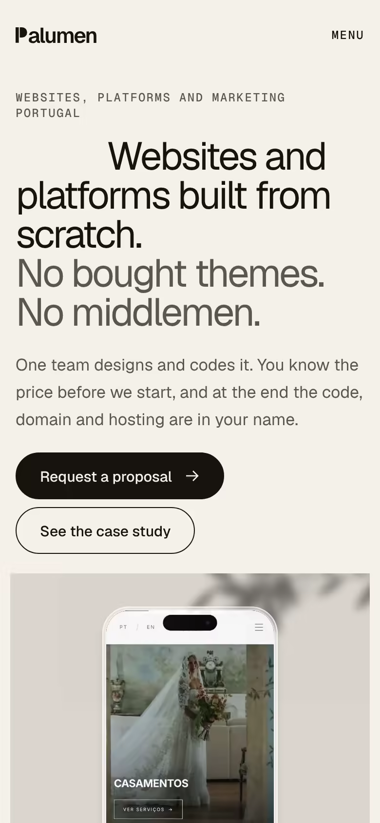
Palumen. Our own website, measured on a phone.
Project information
- Sector
- Website, design and marketing studio
- Year
- 2026
- Services
- Deliverables
- PT/EN website, Case studies, Proposal request, llms.txt, Brand manual
- Sector
- Website, design and marketing studio
- Year
- 2026
- Services
- Deliverables
- PT/EN website, Case studies, Proposal request, llms.txt, Brand manual



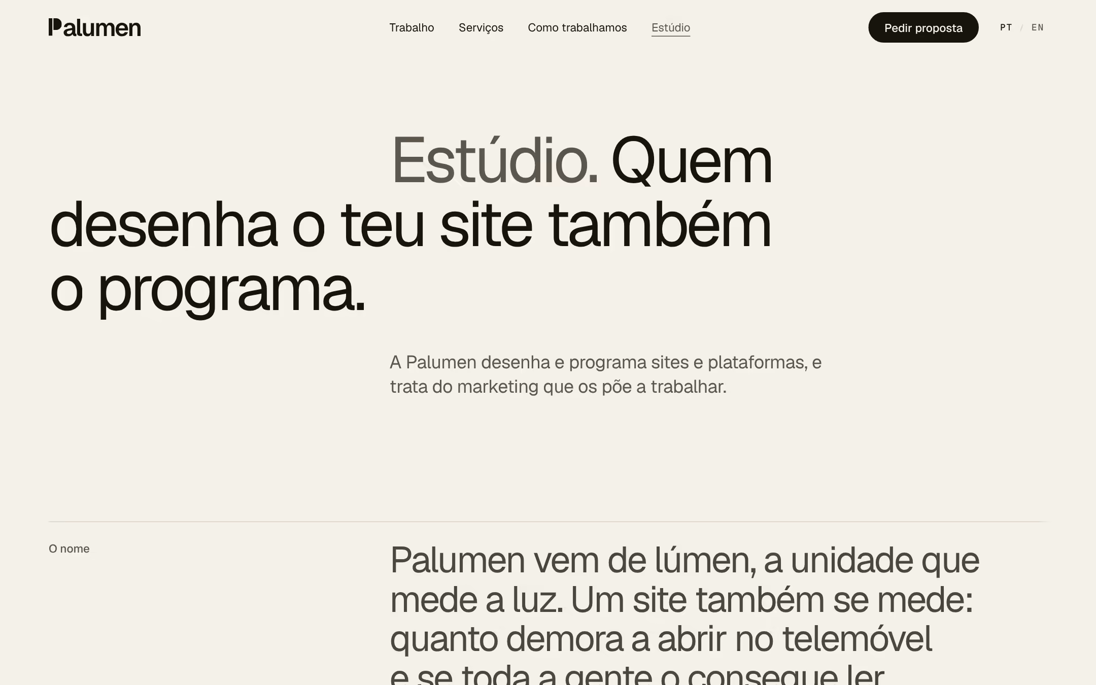
We designed and coded our own website to three rules: one typeface, motion you can switch off, and measured on a phone before launch.
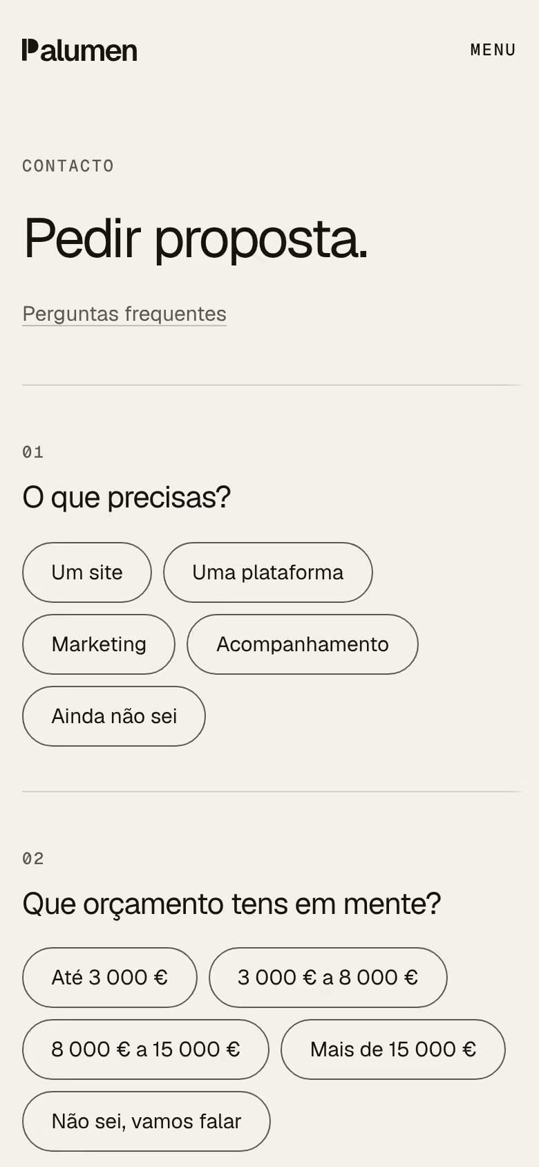
A website in Portuguese and English, with the case studies, the services, the proposal request and a plain-text summary for AI assistants. One team designed and coded all of it.
Typography
One typeface.
The site uses a single type family, Geist, with Geist Mono for labels and numbers. No italics. With one family, hierarchy comes from size, colour and space.
The sizes live in the brand manual, in a tokens file the code reads: from the home page headline, which runs from 44 to 112 px depending on screen width, down to 13 px captions. Every size grows with the screen without jumps, and no page makes up its own.
Motion
Motion you can switch off.
On the home page, the case scene opens from the margins to the full width as you scroll. It's CSS tied to the scroll: no JavaScript counting pixels. The box has its final width from the first frame and only the crop changes, so nothing on the page jumps.
If you ask your operating system for less motion, the scene is already in place, headlines don't slide up and images have no parallax. Videos and the swaying leaves have a pause button, and the pause carries over to the next pages.
We don't use GSAP, Lenis or Three.js. The only animation library is Motion, and it only loads when you open the menu on a phone.
Measurement
Measured before launch.
We measure the site with Lighthouse on mobile, with the default profile (small screen, a processor four times slower and a simulated slow 4G connection), three runs per page, on the production build, before launch. The median is what counts. The four pages tested are the home page, services, the proposal request and the Líquen case study.
Lighthouse 12, mobile, median of three runs: performance between 96 and 97 across the four pages, and 100 for accessibility, 100 for best practices and 100 for SEO on all of them. (22 October 2026)
In the same runs: largest contentful paint (LCP) between 2.4 and 2.6 s, total blocking time (TBT) between 85 and 128 ms, and a cumulative layout shift (CLS) of 0. Served over HTTP/2, as on Vercel, the same pages have an LCP between 1.8 and 2.3 s. (22 October 2026)
axe-core 4.11, with the WCAG 2.2 AA rules and best practices, at 1440, 390 and 360 px wide: 0 violations on 12 pages, six in Portuguese and six in English (the four tested above, the work list and this case study). (22 October 2026)
Production build: 0 KB of GSAP, Lenis or Three.js. On first load, these pages download no animation library at all; Motion (43 KB gzipped) only downloads when you open the menu. (22 October 2026)
Anything we don't know yet is flagged in the code. The production build hides it, and a script walks every page in the sitemap and counts the flags that reach the live site: the count has to be zero.